Agidens - Progress Never Stops - typographical brand refreshment
Job
Brand design, motion design
Work done for BBC - a B2B creative agency

After a rebrand a couple of years ago, Agidens lost the connection between its identity and its employees. The industry expert in automation and production processes had been going astray from their true core and spirit. They came to BBC - a B2B creative agency to try once more and steer their identity in the right direction.
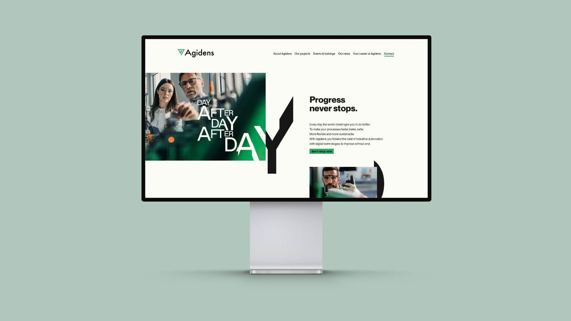
Strategy quickly determined ‘Progress Never Stops’ as being the tagline that encompasses Agidens’ identity the best. Since our times are only speeding up and innovations happen daily, manufacturers are confronted with growing demands and newer, more efficient technologies. Agidens is their partner in this evolution, enabling them to adapt and progress whenever they need it, without end.
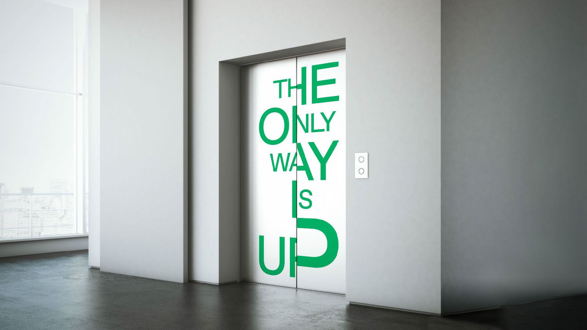
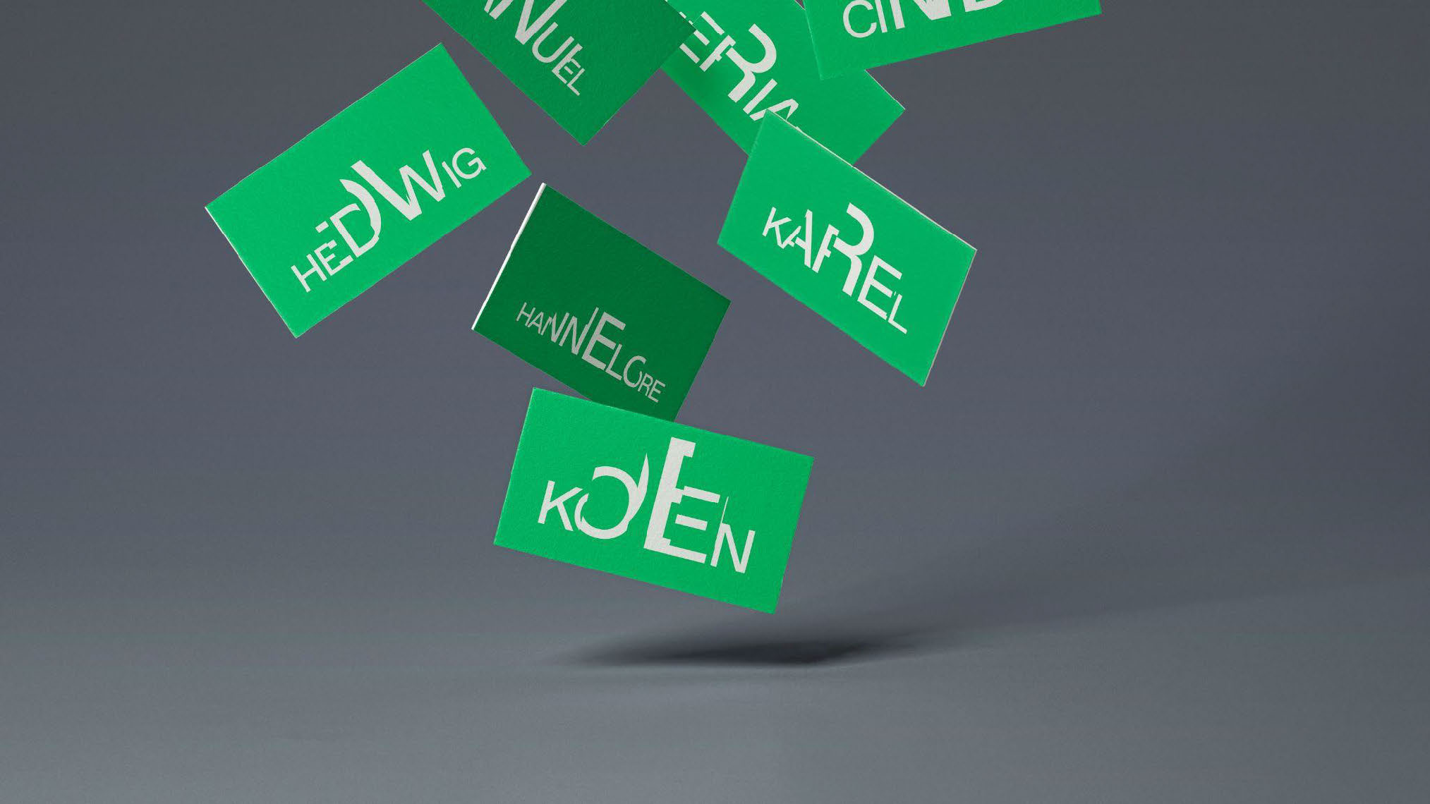
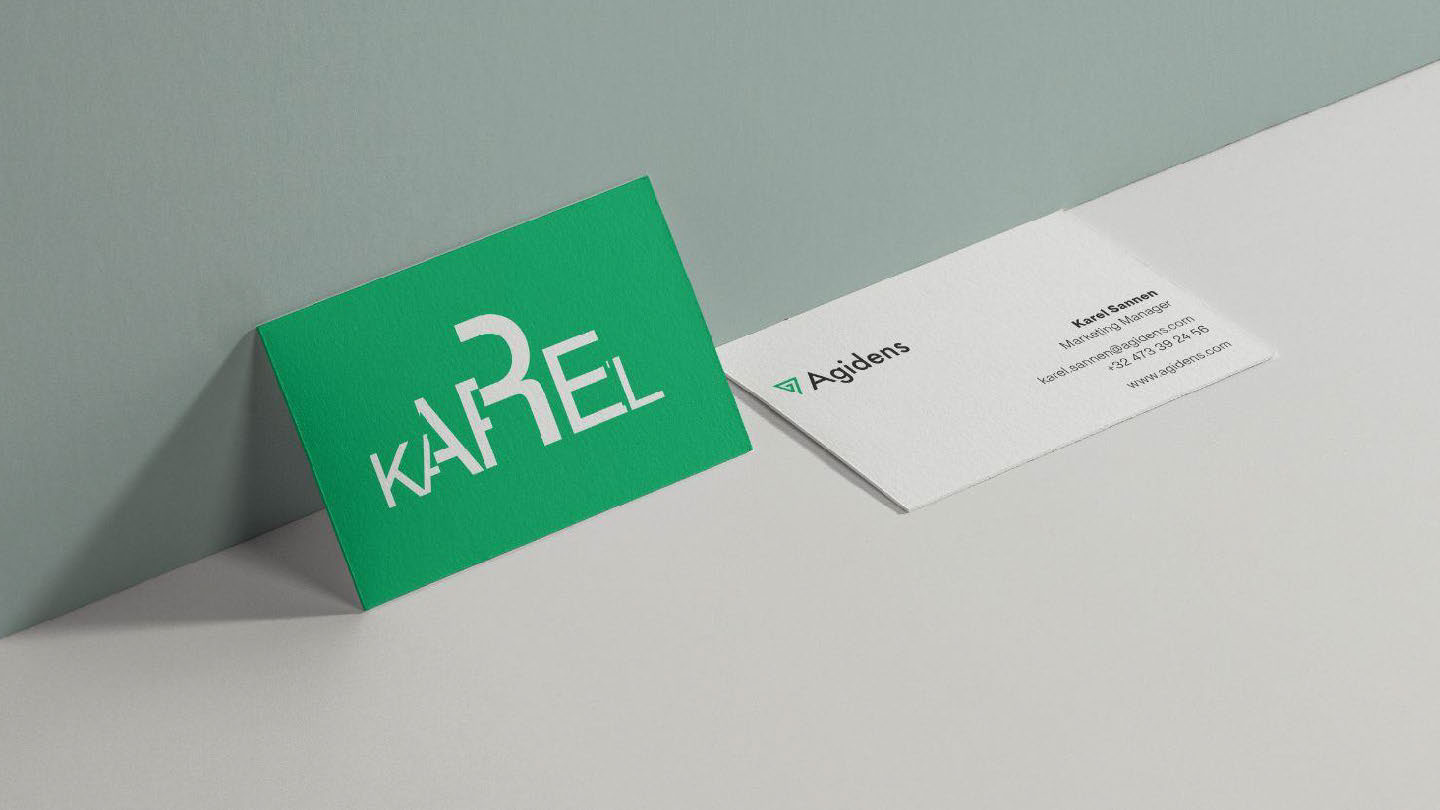
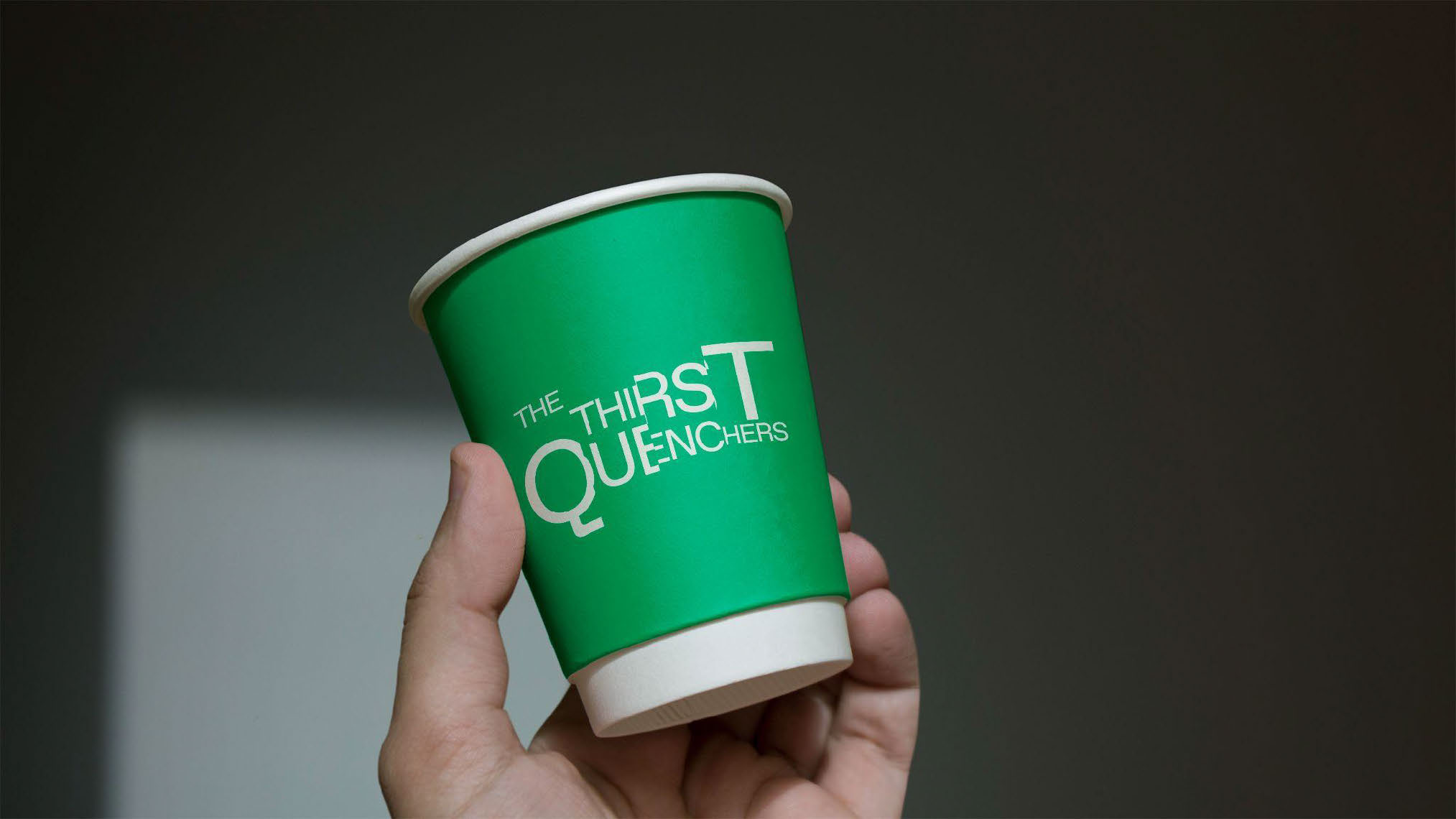
The refreshed identity is captured by a new motion language. All caps taglines and oneliners are segmented and each segment is incrementally being scaled up or down. The words move horizontally and make room for the next, creating an endless stream. It’s the visual representation of ‘Progress Never Stops’.

I made a setup in Cavalry, the procedural animation software, to be able to change the taglines, the number of segments and the scaling factor. This way, an array of typographical images could be generated while staying close to the identity. The text is set in ABC Favorit to reflect a technical, approachable, reliable and contemporary character. The typography is then combined with imagery, depicting Agidens’ customers: professional cutting edge manufacturers seeking to optimize their processes and deliver the best goods to their own customers.
Unfortunately, this concept lost the selection to another concept we proposed.